The Complete Guide to Amazon A+ Content Optimization in 2025
Why A+ Content Matters More Than Ever
If you sell on Amazon in 2025, A+ Content is no longer optional. Ads are getting more expensive, competition is tighter, and buyers compare multiple listings before they decide. A+ Content is where you turn casual visitors into confident buyers by using visuals, storytelling, and clear explanations instead of only plain text.
What A+ Content Really Is in 2025
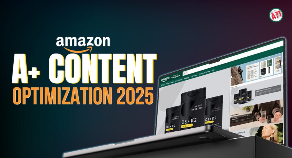
A+ Content is the rich, visual section below your main bullets and images. Instead of one long text description, you can add banners, lifestyle photos, comparison charts, feature highlights, and brand storytelling.
Basic vs Premium A+: What’s the Difference?
Basic A+ gives you image and text modules, simple comparison tables, and a clean layout. This is the foundation almost every brand should use. If you don’t have it, your listing usually looks weaker next to competitors who do.
Premium A+ is the next level. It unlocks video, carousels, interactive hotspots, and more advanced layouts that feel like a full website section inside Amazon. Not every brand qualifies, but if you do, it’s a powerful way to increase engagement and answer complex questions in a visual way.
Fix the Basics Before You Design Anything
A+ Content cannot rescue a broken listing. Before you start designing, make sure your fundamentals are strong. Your main image stack, title, bullets, and pricing should already be clear and competitive.
You also need a sharp value proposition. Know the top two or three reasons someone should pick your product over another. Those reasons will drive the structure of your A+ modules and the headlines you use in each section.
Think Like a Landing Page, Not a Product Brochure
The best A+ Content in 2025 feels like a landing page. It guides the shopper, instead of throwing random images at them. Start with a strong hero banner that explains who the product is for and what main problem it solves in one simple line.
After that, break your story into small, digestible sections. Each module should have one clear focus: features, benefits, how it works, what’s included, sizing or compatibility, and so on. Short copy, clear headlines, and supporting visuals will always perform better than long blocks of text.
Using Visuals to Explain, Not Just Decorate
Every image in your A+ section should have a job. Lifestyle photos show how the product fits into real life. Infographic-style images zoom in on details, label key parts, and explain features that are hard to describe with text alone.
Comparison charts work well when you have multiple models or variations. They help buyers quickly see which version is right for them without leaving your listing. This reduces confusion, lowers returns, and prevents people from clicking away to other brands.
Brand Story: Turning Browsers into Fans
The Brand Story section is your chance to talk about more than one product. Here you can explain your mission, show your full product range, and connect emotionally with your audience.
Instead of generic phrases, use this space to say why you started, what problem you’re obsessed with solving, and what makes your approach different. For shoppers who care about values, quality, and long-term trust, this section can make a big difference.
Making the Most of Premium A+ Modules
If you have access to Premium A+, treat it as your “show, don’t tell” zone. A short video can show installation, usage, or before-and-after results far better than text. Interactive hotspots can highlight hidden features or materials when customers hover over certain parts of an image.
Carousels are perfect for step-by-step guides, multiple use cases, or different customer profiles. You can show how one product solves different problems for different people, all within the same page. This is especially useful for complex or higher-priced products.
Keep It Clean, Consistent, and Compliant
Design consistency matters. Use a simple color palette that matches your brand, and keep the same style of icons, fonts, and photo editing across the whole A+ section. When everything looks unified, your brand feels more trusted and professional.
At the same time, remember Amazon’s rules. Avoid making medical or unrealistic claims, don’t add external links or contact details, and keep your text easy to read. Short paragraphs, clear headings, and well-structured images help both humans and Amazon’s review teams.
Mobile Experience: Where Most Shoppers Are
By 2025, a big portion of Amazon traffic is mobile. That means your A+ layout must work on small screens. Long, crowded images with tiny text become unreadable on a phone.
Design with mobile first in mind. Use larger fonts, clear contrast, and simple compositions. Test your images by previewing how they might look when shrunk down. If a buyer cannot understand the message in a quick scroll on mobile, it needs to be simplified.
Measuring the Impact of Your A+ Content
Once your A+ Content is live, watch your numbers. Keep an eye on conversion rate, sessions, and unit session percentage. If these improve after your update, it’s a strong sign that your visuals and messaging are working.
Also monitor your reviews and questions. If customers still feel confused about sizing, ingredients, or features, use that feedback to adjust your A+ modules. Answer those questions visually in your infographics, comparison tables, or short text sections.
A+ Content as a Long-Term Asset
A+ Content is not a one-time design task. Markets change, competitors improve, and your own product line evolves. Refresh your visuals and copy at least once or twice a year to stay ahead.
In 2025, the brands winning on Amazon are those that treat A+ Content like a serious marketing asset. When you combine smart storytelling, clean design, and customer-focused explanations, your product page becomes more than a listing. It becomes a sales machine that works for you 24/7.